


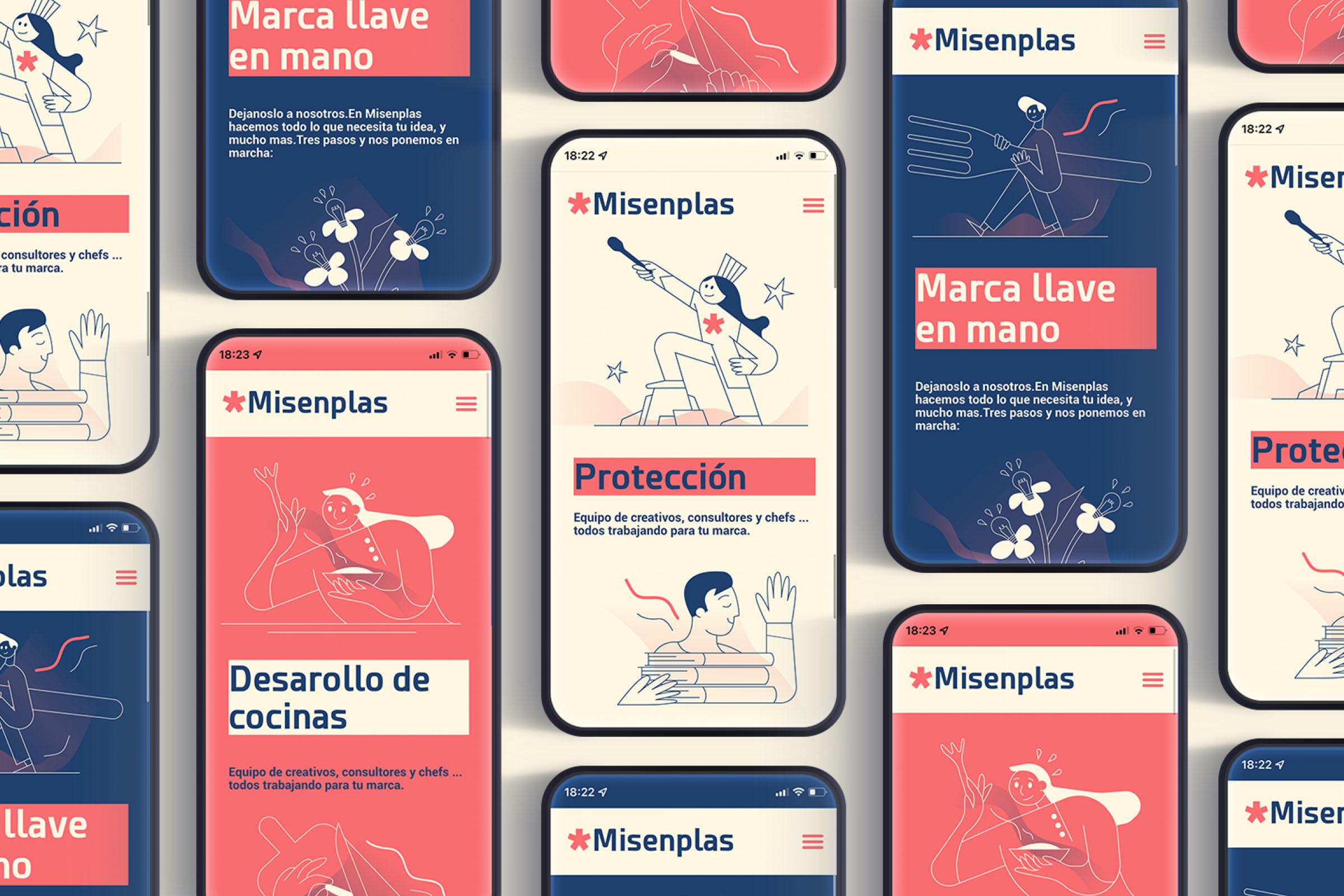

Daring, surprising and resolute. These are some of the qualities that Ana and Daniel, their creators, represent in their new adventure: Misenplas Consulting.
A company dedicated especially to facilitating the process of opening a business within the hostel, and A little too much has wanted to help them in the creation of their brand.
The vibrant and unique colors are some of the elements that the team has wanted to highlight. Its asterisk, its main icon, symbolizes the union of all the brand values that Misenplas represents.
Among the works carried out by the A little too much team, highlights are the corporate identity, infographics, animation of graphic elements, and presentations.
Design team: A little too much.